Saturday, June 30, 2018
Purikura Review I Heart P
Purikura Review I Heart P
The machine name is really written as I?P. I�m assuming it�s pronounced as �heart� not �love�. The P stands for Puri, Pink and Party. It�s appeal points seem to be fun and variety.
With this machine the first screen is outside the booth. 

First you have to choose your course. I�m honestly not seeing much difference in a lot of the recent courses, perhaps I�ll do a comparison post at some point. Supposedly ????is more glowy and ????is more matte. We chose the matte one.

Still on the outside screen you need to enter your names and choose your backgrounds. There are just sets to choose from, divided in to sections: Beautiful (???), Stylish (????), Trend (????) and Normal (????).


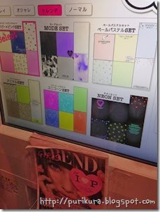

Then you get to choose the style of your collage, you can choose between �Oshare� and �Color�.

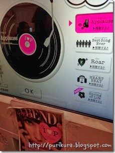
You can also choose your BGM (background music). A few machines have this option for the decoration screen but this is the first one that I�ve seen that gives you the option at the beginning. We chose Roar. I wonder if they will switch up the options on this in future updates.

Then you can go inside. It has quite a lot of lights, including an overheard one, but the walls are black to stop faces being blanked out too much.
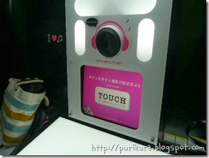
There was also this cute message on the side where you put your bags!

As well as the pink there�s a bit of a music theme going on- the speakers and the camera have music decals. I also like the �Give me a Pose!� which makes it look like �Give me a P!� There are some nice touches on this machine.

You take two each of three kinds of pictures, regular ones, diagonal ones (I missed the photo for it!) and full length. This is the second machine I�ve used that has the diagonal shot, the other was Gyza. The diagonal one takes a bit of getting used to but it�s a nice change.

You also take one more for your collage shot. And choose your eye size and skin tone.

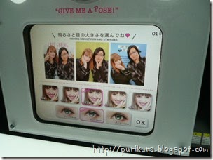
Then it�s off to the decoration booth.

The sections are pretty standard, you have Special, Pen, Stamps, Message, Make and Funny.
Special is where the names, dates, couple, one-touch and seasonal things are.


Pen is for, well, pens�

Stamps are grouped by style, there are some cute ones in there.

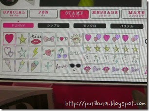
Message has some hand drawn style ones which are different.

And these wiggly ones which are supposed to fit around your body, you may need to tweak the size and tilt to get it close though!

You can change the colours of the Japanese stamps which is a start but still doesn�t help with multi-coloured clothes, or if the two of you are wearing different colours.

Make has lip colour, cheeks, eyelashes etc. Apart from the cheek stamps these never quite look right to me! I guess it�s more aimed at younger girls who might not wear much make up anyway.
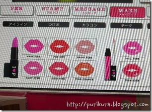
Funny is where you�ll find accessories, word bubbles, sunglasses etc


In the layout as well as the options for many people you can also choose to have the thin long style or the shorter version. I would always choose long because it fits in my purse better.
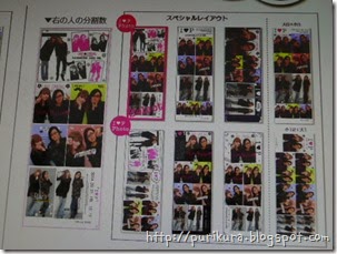

Overall I quite like this machine. Although there is nothing huge that makes it stand out, the options are all good and the print out is nice. It�s a cute looking machine itself too. We took the pictures at a busy time so I would like to go back and spend more time on the decoration section!
Anyway, here are our pictures:
Regular:


Diagonal:

Full Length:


Collage:

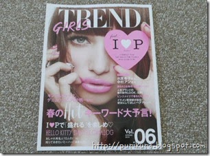
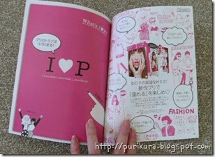
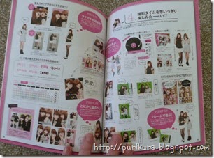
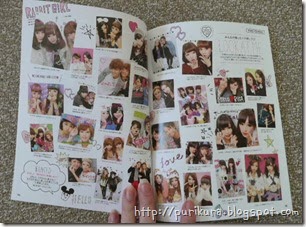
Also! As this is the newest machine from FuRyu they released a new version of Trend magazine to go with it. The first 200 people who use this machine and ask will get a copy. (Other game centres may have different conditions.) It has the usual fashion, make up and trend pages as well as some pages devoted to I?P.
I like these magazines just for the purikura information!

